library(ggdist)
# Índice para junio 1 — igual que J_pred en el artículo Gaussiano
j_pred_fin <- as.numeric(lubridate::ymd("2026-05-31") - min(encuestas_raw$fecha)) + 1L
cols_gauss_fin <- paste0("p_pred[", j_pred_fin, ",", 1:6, "]")
color_map_2026 <- tibble::tibble(
cod = cand_codes,
color_cand = c(colores_2026[["ic"]], colores_2026[["adle"]],
colores_2026[["pv"]], colores_2026[["sf"]], colores_2026[["cl"]])
)
gauss_draws_fig <- arrow::read_parquet(
gaussiano_path,
col_select = dplyr::all_of(cols_gauss_fin)
) |>
purrr::set_names(c(cand_codes, "ruido")) |>
tidyr::pivot_longer(dplyr::everything(), names_to = "cod", values_to = "prop") |>
dplyr::filter(cod != "ruido") |>
dplyr::left_join(candidatos_2026_df, by = "cod") |>
dplyr::left_join(color_map_2026, by = "cod") |>
dplyr::group_by(cod) |>
dplyr::mutate(candidato_m = mean(prop)) |>
dplyr::ungroup()
nombre_orden_2026 <- gauss_draws_fig |>
dplyr::distinct(cod, candidato_m, nombre) |>
dplyr::arrange(candidato_m) |>
dplyr::pull(nombre)
gauss_draws_fig |>
dplyr::mutate(nombre = factor(nombre, levels = nombre_orden_2026)) |>
ggplot2::ggplot(ggplot2::aes(x = prop, y = nombre)) +
ggdist::stat_dist_slabinterval(
ggplot2::aes(
fill = color_cand,
fill_ramp = ggplot2::after_stat(level)
),
.width = c(0.5, 0.8, 0.95, 0.99),
interval_alpha = 0.95,
show.legend = c(fill = FALSE, fill_ramp = TRUE, size = FALSE)
) +
ggdist::stat_pointinterval(
ggplot2::aes(label = scales::percent(candidato_m, accuracy = 0.1)),
geom = "label",
.width = 0,
vjust = -0.5,
fill = "white",
color = "black"
) +
{
res_fig <- resultados_2026 |>
dplyr::rename(nombre = candidato) |>
dplyr::left_join(
dplyr::left_join(candidatos_2026_df, color_map_2026, by = "cod") |>
dplyr::select(nombre, color_cand),
by = "nombre"
) |>
dplyr::mutate(
nombre = factor(nombre, levels = nombre_orden_2026),
y_num = as.numeric(factor(nombre, levels = nombre_orden_2026)),
resultado = resultado / 100
)
list(
ggplot2::geom_segment(
data = res_fig,
ggplot2::aes(
x = resultado, xend = resultado,
y = y_num - 0.4, yend = y_num + 0.4,
color = color_cand
),
linewidth = 2.5, inherit.aes = FALSE
),
ggplot2::geom_label(
data = res_fig,
ggplot2::aes(
x = resultado,
y = y_num + 0.6,
label = scales::percent(resultado, accuracy = 0.1),
fill = color_cand
),
color = "white",
size = 5,
fontface = "bold",
label.size = 0,
label.padding = ggplot2::unit(0.25, "lines"),
inherit.aes = FALSE
),
ggplot2::scale_color_identity(guide = "none")
)
} +
ggplot2::scale_x_continuous(
labels = scales::percent_format(accuracy = 1),
expand = expansion(mult = c(0.05, 0.15))
) +
ggplot2::scale_fill_identity(na.translate = FALSE) +
ggdist::scale_fill_ramp_discrete(
name = "Intervalo creíble",
range = c(0.25, 1),
breaks = c(0.5, 0.8, 0.95, 0.99),
labels = c("50%", "80%", "95%", "99%"),
na.translate = FALSE
) +
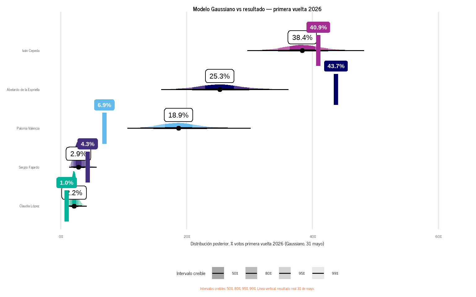
ggplot2::labs(
x = "Distribución posterior, % votos primera vuelta 2026 (Gaussiano, 31 mayo)",
y = NULL,
title = "Modelo Gaussiano vs resultado — primera vuelta 2026",
caption = "Intervalos creíbles: 50%, 80%, 95%, 99%. Línea vertical: resultado real 31 de mayo."
) +
theme_recetas(base_size = 16) +
ggplot2::theme(
panel.grid.major.y = ggplot2::element_blank(),
panel.grid.minor = ggplot2::element_blank(),
legend.position = "bottom"
)